Lino Printing:


For my first Lino Print, I feel I was too ambitious. For this piece I wanted I have an eerie look, as well as still keeping all the detail. I found this really difficult as I had only ever create simple things before with Lino Print. I was hoping to keep the background white, with no ink, but since I didn't leave a border around my Lino Print, the background I cut just got ink on it anyway. After realizing where I went wrong, I realize that it was simple mistakes and I knew what to avoid for next time.
For this piece I used a bench hook, a roller, a sheet of acetate, some ink, and cutting tools. The bench hook was so I could have something to push my Lino against whilst I cut. The roller was so I could smooth out the ink on top of the acetate, and spread it evenly without getting myself or anything else messy/covered in ink. I then used the cutting tools to remove the Lino, making sure I didn't cut towards myself or put my hands in the way of the cutting tool.
For this piece I used a bench hook, a roller, a sheet of acetate, some ink, and cutting tools. The bench hook was so I could have something to push my Lino against whilst I cut. The roller was so I could smooth out the ink on top of the acetate, and spread it evenly without getting myself or anything else messy/covered in ink. I then used the cutting tools to remove the Lino, making sure I didn't cut towards myself or put my hands in the way of the cutting tool.


Learning from my past mistakes, I decided to go really simple. Doing so, I ended up going a little too small and then making it difficult for myself to cut. I actually like how this one turned out, and I think I did a good job. I like that its simple, and its not spotty or messy. However, I do think I should've made it bigger so that it would be easier for me to cut.
To create this piece I used the same materials as above.
To create this piece I used the same materials as above.
For this Lino Print, I was giving the theme natural forms, and then a range of objects to choose from. I sketched out the objects I had in front of me, then and then looked at each one to see what I could see in them. I saw many different things, and just started sketching and writing what object I saw them in. From the flower/plant, at first I saw a cage, but I thought that was too obvious, so I kept looking and ended up seeing a tomato wrapped in barbed wire. I went with a tomato trapped in barbed wire because I did see a cage at first, and when you are in a cage, you're trapped. For the flat shell I saw a sting ray. It took me ages to see something worthwhile, or at all, but I got there. I decided to add polka dots to my sting ray because I thought it looked kind of boring and plain. From the bigger shell I instantly saw a reptile eye. This was from the angle and shape of the opening on the shell. With that I then tried to explore my ideas, so I sketched a cave, but I wasn't feeling it. I then thought maybe a human eye, but again, I didn't think it was as good as the reptile eye. I added colour to the reptile eye because it was my favourite and I wanted to highlight that.
I then got a piece of Lino and sketched the reptile eye onto it, and began cutting it out. It took awhile because I really wanted to take my time on it and make it good. I made sure to get all the detail in and not leave any gaps or chunks. Once the Lino was cut, I began to print it out. I love how it turned out and I'm very happy with the results.
Next to the print I put how I made the print, and the safety precautions taken to make sure I wasn't injured.
I then began to experiment and try different techniques. For the images above I drew a silhouette of a lizard, since my print was of a reptile eye, and then I put it over the Lino print so that once it printed there would be a lizard left behind. I loved how these turned out and I like how different they are. I decided to use some paint pens to outline the silhouettes and add some detail. This was so it would be different and and the prints didn't look too similar.
I am really happy with how these turned out, and I like the different compositions and colours.
I am really happy with how these turned out, and I like the different compositions and colours.
Etching:


IMAGE 1: sketch IMAGE 2: etched acetate IMAGE 3: print
For this piece I decided to do some Koi Fish. This is because they stand for courage and bravery, and they're also native to Japan. I really enjoyed creating this piece, and think it turned out really well. For this, I wanted to get a lot of detail, and really take my time on it. At first my idea was to fill the background and have plants and cherry blossoms, drawn very simple as not to distract from the detail on the fish, and fill the negative space. I ended up not adding the background in, as I was running out of time and really wanted to see how the final piece would look. Once I had it printed, I realized I didn't have enough ink on it, so some of the detail has been lost. However, I do really like this piece and I love the detail I managed to get. I also like that its simple, because then it makes the whole piece about the fish rather than making it about them being Japanese.
For this piece I decided to do some Koi Fish. This is because they stand for courage and bravery, and they're also native to Japan. I really enjoyed creating this piece, and think it turned out really well. For this, I wanted to get a lot of detail, and really take my time on it. At first my idea was to fill the background and have plants and cherry blossoms, drawn very simple as not to distract from the detail on the fish, and fill the negative space. I ended up not adding the background in, as I was running out of time and really wanted to see how the final piece would look. Once I had it printed, I realized I didn't have enough ink on it, so some of the detail has been lost. However, I do really like this piece and I love the detail I managed to get. I also like that its simple, because then it makes the whole piece about the fish rather than making it about them being Japanese.
Mono Printing:


Above are two practice pieces created to so I could get better with it.
IMAGE 1: For this practice piece I used torn cardboard, torn card, a screw, and a bolt. This was so I could get different textures and get used to using different materials.
IMAGE 2: For this piece I lay down my ink then put a piece of paper over the top, then drew my design on the back. This was so I could get thin lines, and detail.
Above are some practice pieces created using: Torn card; ripped cardboard; a can (for circles); screws; bolts; and a pen lid.
I made these examples to help figure out textures and effects I could get using some random objects.
I made these examples to help figure out textures and effects I could get using some random objects.


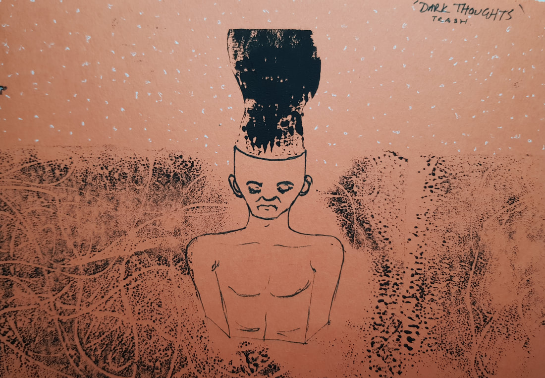
For this piece I started with a concept sketch just to make sure I had a clear idea before going in. I came up with the idea of that 'speechless' is a terrible thing. Being speechless can hurt others around you even if you feel like you can't say anything. With this sketch I wanted it to show that he feels like he can't say anything, but he can see his silence has some seriously negative effects.
For this print, I got a plain piece of paper, and placed it over the ink and started drawing on the back. Since I wanted to have words, I had to write them backwards so they would be the right way round on the print.
I'm really happy with the original sketch, but when it came to the print, I don't think it came out too great. And that is the photo of the best print. I had troubles trying to get the right amount of ink, but I also think I was pressing down on the background, making it darker. I also think I should put more pressure on the details when creating the print.
Knowing my mistakes, I now know what to avoid for next time.


A few experimental pieces.
For the first image, I scrunched up a piece of paper then placed it on top of the ink for some nice textures and patterns.
for the second image, I put a plain sheet of paper down on top of the ink, and I drew my image through it. Then, with the image still being visible on the ink, I got an orange sheet of paper, and made another print. I like the contrast of the images, and how on the first print the skull is black, and on the second print the skull is white.
For the third image I drew out the character, then I drew it again on a separate piece of paper to make a silhouette, so I could print around it. With the messy background, I then added a dark wavy shadow coming from the characters head using the ink.
Overall, I didn't spend too much time on these experimental pieces, Bur I'm happy with how they turned out.
Collagraphy:

This was my first attempt at collagraphy, and I feel I was a little too ambitious. I wanted to have a full rose, and have it look somewhat realistic. Cleary that didn't happen. It didn't quite work out how I wanted, but I'm not mad at the results, I feel like it was definitely good for a first attempt, but that I could also do better.
[On the left is the template, and on the right is the print]
[On the left is the template, and on the right is the print]

This was my second attempt at collagraphy, and I think going simple definitely worked in my favour. I love how these prints turned out. My first print didn't have enough ink on it, so when I went to put more ink on it, one of the eyes moved (because I didn't leave it to dry long enough) and it messed up the print. I'm still happy with the end results, although I do wish I was a little more patient and let it dry longer.
DAnhorn. "Glen Alps Collograph Printing Disassembly". Online Video Clip. YouTube. YouTube. Jul 1, 2016. Web. Dec 7, 2020.
Above is a documentary about the process Glen Alps uses for his collagraph printmaking.
For my Collagraph pieces I used some think card, scissors, glue, a roller, and some ink. I used the card to cut out my design and layer it onto another piece of card to create a print. I then glued it all down to create the design I wanted. Once the plate set I used a roller to ink up my plate and then I used a piece of paper for the prints. I was very surprised at how well the prints turned out, and the quality of the prints. I do feel like I could've done better, but for my first try, I think it turned out pretty well.
