Van Dyke Crystals:


Here I am practicing, and learning, how to use Van Dyke Crystals. On the first image I am using different techniques that could be used with the Van Dyke Crystals. The first technique was using wax. With this, you add wax to the paper on the areas you want to stay white/be blank space. then you apply your Van Dyke solution over the top. For this one, I enjoyed making it, but I wasn't too pleased with the final result. For the second technique, you do a wash of colour using the solution, then apply rock salt over the top. This one didn't work for me, and I'm not too sure why, so I wasn't too happy with the results. For the next technique, I put a blob of solution onto the page, and got a straw, and blew it around. I really enjoyed this one and I'm happy with the results. For the next one, I did a wash of colour, and whilst it was still wet, I put a small piece of cling film on it. as it was drying I pulled the cling film off and got a cool effect. I am happy with how this turned out, and it was pretty simple to get the effect wanted. This next one was created by me adding straight solution (not watering it down) onto the paper, so it was as dark as possible. Then using a clean brush and some tissue, I put some water onto the page and used the tissue to life to colour so that I had both dark and light. This looks really messy, but I'm happy with how it turned out. The next technique was created using brush splatters. This was really fun to create and it does look messy, but I am happy with how it turned out. This next technique was done using bubble wrap. It uses the same process as the one with cling film, just instead of cling film, its bubble wrap. This one didn't turn out exactly how I wanted it too, and it actually looks quite messy. I'm not entirely sure what went wrong with it, but I'm still happy with it. Finally, this last one was create by starting with a very light wash of colour and slowly, and carefully, adding more and more solution, making it darker. I love this technique the best as it looks neat and I think it turned out really well.
After practicing with the Van Dyke Crystals, I then moved onto my first piece.
For this piece, I took one of my boots and put it on my desk. I turned it around and drew the different angles until I was happy with it. I rendered my favourite sketches with brown pencil to get an idea of how it would look coloured with the Van Dyke Crystals. In the end I ended up going with the last sketch, not because it was the best, but because with the way the light was hitting it, there were very deep shadows and light highlights. I feel it had the most depth, so I went with it. I sketched it out again, but this time on water colour paper, and i started my painting. I feel like I went too dark because once I started adding the shadows, they just blended into the actual piece. to bring out the detail and shadows, I had to use a black pencil.
I then found another object in my room, a candle, and began sketching that in different positions for my next piece.


Image 1: graphite rendered drawing, with coloured pencil background, and paint pen for highlights and shadows.
image 2: Van Dyke Crystal painting of boot, with evaluation.
image 2: Van Dyke Crystal painting of boot, with evaluation.


After I sketch my candle out a few times to find the angle/position I was happy with I then painted it using Van Dyke Crystals. For this painting, I put a light wash of colour down first. After the wash dried, I sketched out the candle. learning from the previous painting, I started a lot lighter, and slowly built up the shadows. I am really happy with how this turned out because I managed to get more depth and tones into the piece.
Image 2: Van Dyke Crystal painting of candle, with evaluation.
I then decided I would create another painting but this time from a reference photo that I took. so I positioned my hand in different ways and angles and drew them until I found one I liked. At first I thought I wanted to draw a fist, so I tried two different angles, but I wasn't happy with either. So I changed up the way I positioned my hand then drew that. Once I was happy, I replicated it onto my paper. I ran out of water colour paper so it became a challenge since the only paper I had kept warping and ripping with the Van Dyke solution.


Image 1: Van Dyke Crystal painting of hand, with evaluation
Image 2: Van Dyke tonal rage with notes, and Van Dyke Crystal painting of frog, with evaluation.
Image 2: Van Dyke tonal rage with notes, and Van Dyke Crystal painting of frog, with evaluation.


The first image was a tonal exercise to help get the correct shadows when drawing/painting from life. we got given this plain white object, that was either a cylinder or a cone, and we were asked to draw the correct proportions and tones. I did a pencil drawing at first just to get proportions and shading. Once I was confident, I then moved onto the painting. I tried to focus more on the actual object rather than the background. I ended up finding this quite difficult, cause if I moved closer I would've changed the perspective and it wouldn't look right. I still found it fun to paint, and I managed to get the basic tones in, but I wasn't able to get any real detail in.
After painting the cylinder, I then moved onto a white cup. This was still to help with tones, but I used an everyday object. I spent a lot more time on this piece to really get the detail and tones correct. I'm really happy with how this piece turned out because i think i got all the tones and proportions correct.
After painting the cylinder, I then moved onto a white cup. This was still to help with tones, but I used an everyday object. I spent a lot more time on this piece to really get the detail and tones correct. I'm really happy with how this piece turned out because i think i got all the tones and proportions correct.
Acrylic Paints:
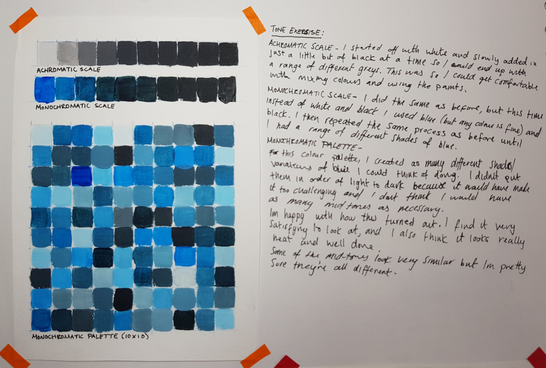
Monochromatic palette (10x10), with notes
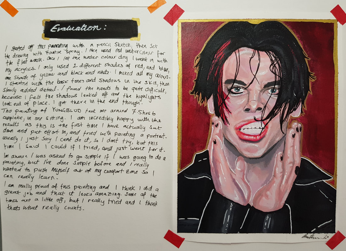
Acrylic painting of YUNGBLUD, with evaluation.


For my next painting I decided to paint my keys. I used acrylic paints on a piece of fabric.
The first image is a few composition sketches with notes. I placed my keys in different positions, trying to make it look as natural as possible. once i decided what composition I liked the most, I sketched it out on the fabric and then began to paint. I found this painting difficult as my keys are quite small, and I was painting them much larger than they really are.
For this piece I tried to make it seem as natural as possible. I placed my keys down, and adjusted them ever so slightly so it would still look natural, but I could get the angle I wanted. I'm happy with how this turned out, because yeah it doesn't look too realistic, but I got all the tones correct and I got the proportions correct. I like the fabric used, not the colour or pattern, but the texture of it. I found it fun to paint on. I do think the painting could have turned out better if I had drawn something bigger, because it was hard to do my keys. I had to make them bigger to fit the piece, and I found that quite difficult. Overall, I like this piece. It make not be my best piece, but I think the composition and lighting works well with the textured background.


The first image is of a few examples of the materials used for the piece below. The first example was of the news paper for the background. And the second example is of the Mod Roc I used to shape the focal point of the piece.
The second image is of the 2 colour palettes I created, and one was used on the piece below. The colours used for the first colour palette were Yellow Ochre, Cadmium Red Deep, Colbalt Blue, Black and White. The second palette was created using Primary Yellow, Primary Magenta, Primary Cyan, Black and White.
The second image is of the 2 colour palettes I created, and one was used on the piece below. The colours used for the first colour palette were Yellow Ochre, Cadmium Red Deep, Colbalt Blue, Black and White. The second palette was created using Primary Yellow, Primary Magenta, Primary Cyan, Black and White.
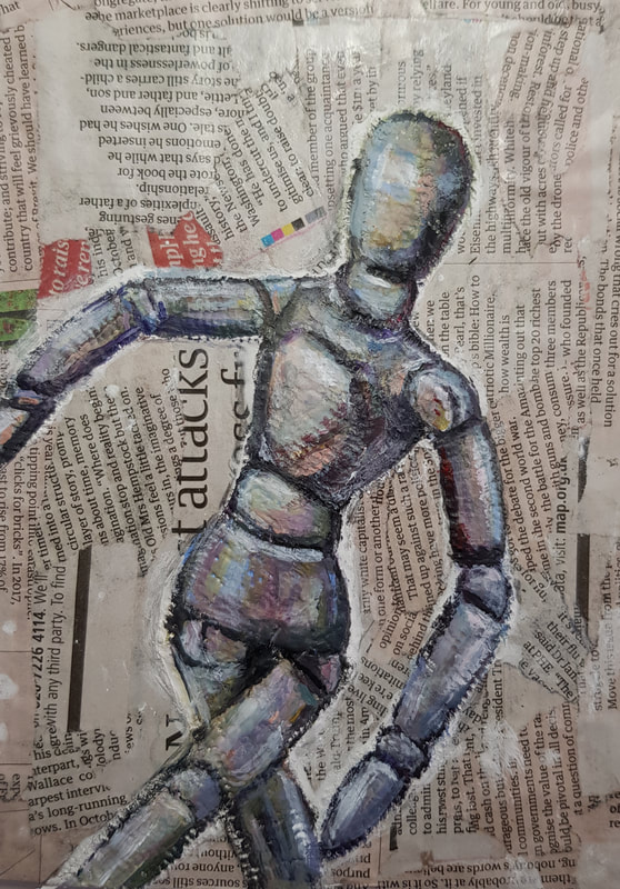
This piece was create using Mod Roc, newspaper and acrylic paints.
To begin with, I got a piece of cardboard size A5, and I covered the entire thing with news paper to create the background. Once the newspaper dried, I then sketched out my wooden manikin, then I used the Mod Roc to fill in the sketch, and bring out the Manikin. Once the Mod Roc had dried, I then went over the top of it with a marker so I could see where I was going to put the paint. For this painting I picked the first colour palette from above. This is because I liked the Earthy tones for this piece. I didn't want to match the colours to the manikin, instead i wanted to use the different colours to create the shading. So, for a lot of the shadows I used a dark purple or black, and for the highlights, I used a lot of pale blues and yellows.
I am very happy with how this piece turned out, and I love how well the colours work with each other, as well as going well with the newspaper background. I really enjoyed creating this piece, and I think it worked out really well. There are a few mistakes, But I think that's what adds to it. I feel if the piece looked very clean, and perfect, then it wouldn't have the same effect.
Inspirations For Final Painting Project:


Above are some paintings by a surrealism artist named Yves Tanguy. I love his work, and I love the colours. In the first piece, its the subject matter that I love, and the colours work really well with it, but I would like it to be more bright. For the second painting, I love the colours and composition.


Above are some paintings by artist, Salvador Dali. I love his work and I love the colours and concepts. With the first piece its the colours I love the most. With the second piece, I love that its a face almost looking down on the world below. With the third piece, I love the colours, I'm not a huge fan on the subject matter or composition, but I love the cold colours. His work is just amazing and most of it is always so bright in colour.


These are some images I found on Pinterest under the search "Surrealism art". I am unsure of the artists, so I can't give credit, but what I love about these pieces are the concepts, and colours. I love that all of them involve a person in one way or another, and they are all changing the subject in a different way. These inspire me because they are beautiful pieces of art, and are done to such a high quality.
Action Plan:
For my paintings, I want to do something similar with portraits, but not the same. I ant to distort the portraits, or add things, or even take detail away, to change the meaning of the piece. I don't want to use realistic colours for my pieces, at least not all the way through it, because I want the colours to convey the mood of the piece. I will be taking all my own reference photos, and I will come up with my own ideas for the backgrounds, if I add a background. I will be using acrylic paints, as I love working with them, and I don't want my pieces to be perfectly blended. I will also be using other materials, like oil pastels, watercolours, and acrylic paint pens. This is so I can experiment more with different materials and try new styles, I want there to be blocks of colour throughout the piece. I hope to create, at least, four small paintings in my sketchbook to help me come up with a concept for my final piece. I want my final piece to be on a medium sized canvas, or piece of cardboard, and I want it to be done to a high standard.
I will take inspiration from all the pieces above, to help me come up with my concepts, whether that be the subject matter or colour palette.
Before I create my final piece, I will have a few concept pieces just so I can make sure that the final piece is the best option, and will be created to the best of my ability.
The canvas chosen for my final piece is 15.5x19.5". I'm excited to work on such a large scale since I have never done a portrait this big before. I chose this size of canvas because I knew it would be a challenge, but it is also manageable within the time limit.
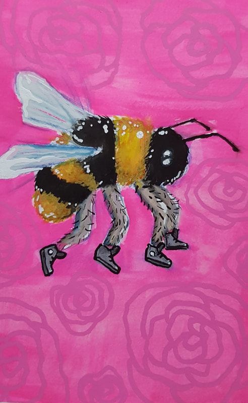
Just as a quick practice, I painted 'The Bees Knees'. I love this idea, and I love this painting. For this piece, I used watercolours. I think the pink works really well with the yellow, but isn't overpowering. I think the legs could've definitely had more detail to them, but I still really like this painting.
It was good to do a piece that wasn't too serious, and was just for fun.
It was good to do a piece that wasn't too serious, and was just for fun.
[can you tell I have a favourite side]
I decided to do self portraits because I could take my own reference photos and do what ever pose I wanted. I also love doing portraiture, so for me, it made sense.
For each concept piece I used a different technique, or materials to really see what I would prefer doing for my final piece.
For the first one, I just used acrylic paints with very little water to get a nice texture from the paint. I used skin tones so when I put the hair in, and the yellow lone, it wouldn't feel like too much colour, and it would be well balanced.
For the second one, I still used acrylics, but I watered the paint down a lot to get different tones from the same paint. I also didn't use skin tones so it could match the feeling I was trying to convey, which is anger. the background is green so that the portrait could really pop, and be the only focal point of the piece.
For the third piece, I wanted to really try and make my piece more inspired by surrealism but completely taking the face away, but still keeping the person. I used oil pastels for the hair and skin, and I used paint pens and acrylics for the hoodie and background. I'm really happy with how this piece turned out, as it is like nothing I have ever done before, and it was my first time using oil pastels for a piece like this.
For the fourth concept piece, I wanted to draw the facial features again, but change how I colour it. I really stepped out of my comfort zone with this one, because I drew things I don't really like about myself, and I had my hair pulled right back. I had also never done anything like this before, and I am really happy with how well the colours work with each other.
I am really proud of myself for these pieces, and I am happy I chose to do self portraits. It has helped with my confidence has I think the pieces are amazing, and I have managed to find some sort of comfort with my insecurities.

Above is the reference photo I will be using for my final piece.
I chose this pose because it is simple, but my head is also angled and my hand is in it. I feel like it will be somewhat challenging, but I also think I will really enjoy working on it.
I chose this pose because it is simple, but my head is also angled and my hand is in it. I feel like it will be somewhat challenging, but I also think I will really enjoy working on it.


Above is my concept sketch on A5, watercolour paper. The other image is of my painting on 15.5x19.5" canvas.
I am really happy with how it is looking just now, and this is my first time doing a portrait this big. I gridded up the sketch, and the canvas so that it would make it easier for me to transfer the sketch over.
For my final piece it will be a painting of me, with half a skull face, but the other half of my face will seem un-phased. This is because death doesn't scare me, and its inevitable. There will also be a sunflower in the background because I see sunflowers as a symbol of hope, and they're my favourite flower. My painting will be somewhat realistic, with the colours and proportion, but the actual technique will be stylised.
There are a few mistakes on the painting, but its nothing I can't fix. I'm hoping to add more detail and get the sunflower looking realistic by the deadline.
This is me around halfway through, so I don't have much more work left to do.
Above is a series of photos showing the detail that has gone into the painting.
You can see each individual brush stroke, and all of the colours.
You can see each individual brush stroke, and all of the colours.

This is the finished painting. I am really proud of how this turned out as it was my first time ever doing a portrait to this scale. I am really happy with how well the colours work together, and how well the composition of the piece works.
I wanted the portrait to be looking towards the sunflower, as I see them as a sign of hope. I also wanted to have half the face be a skull, because I don't fear death. I know so many people that do, but for me, instead of fearing death, I embrace life. sure there are days where I just don't want to do anything or see anyone, but I always do what I want, and what will make me happy.
I really love this piece, and I had a lot of fun creating it. I love every part of this painting, and I think it's one of the best pieces I have ever made.
If I were to do this again, I would just double check all the proportions where exact.
overall I love this piece, and I spent a lot of time on it, and I love it. making this piece was a challenge, and I really stepped out of my comfort zone for this, and I am so glad I did.
