Still/Life drawing - learning proportions
For the images above, I was practicing proportion, perspective, and learning how to create and use an overlay. I was also learning different ways to create a person, and get the proportion correct. To start with, I started with the basic structure and proportions, then began to add the detail once I was happy.
[There are notes on the sketches above]
[There are notes on the sketches above]

This was my first Life Drawing that was a full body of a model. I've done head studies before and thought this would be similar, but it was so much harder than I thought. I had to really think about the proportion and not think to much about the detail.
I really enjoyed working on this drawing as it showed me what I'm good at, and what I need to work on. From this drawing I learned that I care too much about detail and it being perfect, as well as my inability to draw feet. I didn't have time to add definition to the shorts to show that one side was rolled up, and creased compare to the other side.
I feel like for a person, it looks really good and its well done. But I don't think I did my model any justice. I feel like I've drawn her a little too wide and made her look somewhat bulky, when she is not. For next time I know that I shouldn't give my model as wide of shoulders, and that I should put more definition into the torso.
overall I am very pleased with how this turned out as it really showed me what I need to improve on and show the quality of work I can produce in a time limit.
Above are some quick sketches created to help understand movement and learn proportion. At first the model sat down in different positions and stood in different positions, changing every 5-10minutes. This was so I could get used to the different angles and positions, and learn how to get me to focus on the basic proportions instead of the details.
The model progressively stood up, from a crouching position. We only got around 5minutes on each pose to help us focus on proportions over detail.
The model progressively stood up, from a crouching position. We only got around 5minutes on each pose to help us focus on proportions over detail.

This was another life drawing study. It was to help learn proportions and different sitting positions. I'm not actually happy with this drawing because looking back, I can see everything that's wrong with it. I feel like I could've and should've done better.


I was practicing drawing hands and feet. this is because they're both difficult, but important. or these drawings I was given a work sheet with different references and I started drawing them. I struggled with the feet drawings, but I enjoyed the hand drawings. Overall I think I did a good job, and I really like the way the hand drawings look. I should definitely spend more time, learning how to draw feet.


Perspective drawings.
The first two images are perspective drawings of the room I was in. They are just quick, scribbly drawings to help me understand proportion and perspective from life. On the second image I was really happy with how it was going, so I put more detail into the tipped over chair on the floor. I made it darker to bring to attention to it.
for the third image, I found objects around the room and placed them in front of me, and started sketching. I made sure they weren't similar shapes or sizes, and that they weren't sitting at the same angle.

Drawing of a clay skull model from life.
For this drawing I found a skull sculpture in the classroom, and set it at the angle I wanted, and drew it. This was so I could work more on perspective and tones from life.
I am really happy with how this drawing looks, and I think it turned out really well. I think I got the shading right, and the proportions correct. I do however think I could've blended i the shading out a bit so that it looked more realistic, but I'm still happy with how it looks.


IMAGE 1: shape and tonal practice
IMAGE 2: concept sketch for a still life/tonal exercise
IMAGE 2: concept sketch for a still life/tonal exercise
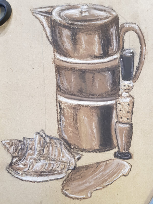
A3 chalk drawing on brown toned paper.
For this drawing I grabbed some random objects from around the classroom, and set them up the way I thought looked best. Then from the concept sketch above, I used that to help with proportions and sketch it on a bigger scale. I used the paper for the mid-tones for certain parts. I then went in with brown chalk and started building up layers. Then I went in with the black chalk, and I put in the shadows. Once I was happy with the mid-tones and shadows I finally went in with the highlights.
Overall, I would say I am happy with this drawing. I don't normally work with chalk, so I don't have a lot of experience with it, but I am happy with the end results.


Above are some life drawings created with soft coloured pastels. These sketches took no longer than 20 minutes to complete, and they were done to help me understand tones, proportions, and perspective. I tried not to focus on the detail and focus more on the post. For these drawings I used blue and yellow pastels, and mixed them to make green for the mid tones, as well as using the paper as its own tone. I prefer the sketches on the brown toned paper as I think the colours look better on the paper, and I think the overall drawing was done better.
For next time, I know that if I'm going to use black paper with the soft pastels, then I would be better off picking different colours so that it works better.
For next time, I know that if I'm going to use black paper with the soft pastels, then I would be better off picking different colours so that it works better.


Here is another life drawing, This time, I really wanted to get everything right. The first image is off sketches of me trying to really understand the pose and get the right proportions and details, The second image is of the actual drawing. I ran out of time to finish the drawing because I spent so long adding the shading and detail into the the face and jumper. I am really pleased with how this turned out though, and I think I got the proportions and likeness correct. If I were to do it again, I would focus more on getting the whole sketch finished before moving on to the shading.

This is a drawing from a reference photo I took awhile ago.
This drawing didn't take me too long to complete and I am very happy with how it looks. I think I got the proportions and tones correct. However, I do regret going in with a black pen as I think it looks a little out of place.
This drawing didn't take me too long to complete and I am very happy with how it looks. I think I got the proportions and tones correct. However, I do regret going in with a black pen as I think it looks a little out of place.
Proko. "Top 5 Shading Mistakes". Online Video Clip. YouTube. YouTube. Web. Jul 19. 2018. Dec 7, 2020.
The video above, shows good tips for drawing a realistic drawing, and knowing how to get the right tones.
This video is very helpful as it shows the do's and don'ts's on how to produce a good drawing.
The video above, shows good tips for drawing a realistic drawing, and knowing how to get the right tones.
This video is very helpful as it shows the do's and don'ts's on how to produce a good drawing.
